The very first The Good, The Bad, and The Interesting Exclusive Design Challenge by Vasilis van Gemert et al.


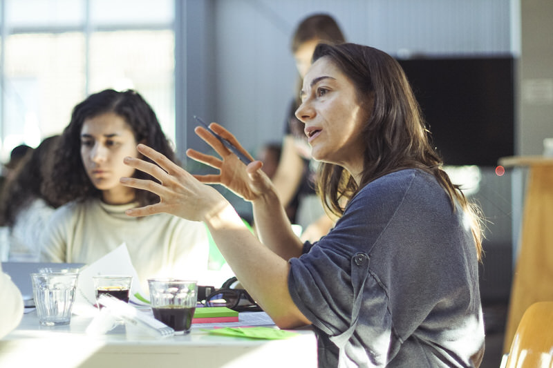
On September 23, 2017 I organised the first The Good, The Bad, and The Interesting Exclusive Design Challenge. An eclectic mix of 16 creatives participated, together with 7 students.
The 16 creatives were all previous guests on my podcast called The Good, The Bad, and The Interesting1, where we talked about their definition of quality. I started recording these conversations in September 2016 and talked to 42 designers, artists, design teachers and other creatives so far. These 16 people were the people who took the invitation.
They worked in teams on four different cases for four different people with disabilities.
They worked with a set of Exclusive Design Principles.
From this list of principles I asked them to focus primarily on identity. Be it the identity of the person they were working for, their own identity or something else’s identity.
I am very happy with the results: They pointed me in a more focused direction, they gave me new insights, and they resulted in a very usable marketing strategy.
The guests were the people I spoke with on my podcast who said yes
when I invited them for this design challenge. They have all kinds of backgrounds. In their daily lives they work in different design branches, in different kinds of roles.
The different roles that the guests have in daily life. The group was 23 people in total, some people have more than one role.
One of the ways to approach accessible design is by using the inclusive design philosophy. The idea behind it is that when you design something for a person with a disability, that the thing also works for the rest of the world.
This philosophy is the common way to design things accessibly on the web. The assumption here is that we can create interfaces that work for everybody equally well: something that works for people with fine eye sight, who use a mouse, or a touch device, and at the same time work for someone who is blind, uses a screen reader and their keyboard as an input device.

The industry is very good at designing visual interfaces that are controlled with a mouse or touch. Some interfaces cover Aarron Walter’s complete pyramid of user’s needs1. From basic functional all the way to pleasurable.

When it comes to alternative interfaces, for instance for people who are blind, or people who can’t use a mouse or touch devices, we are not so experienced. Most interfaces barely touch the very lowest bar of the pyramid.
In order to create truly inclusive designs we need a level playing field. We need to be as good at designing alternative interfaces as we are at designing visual interfaces. We have some catching up to do.
I flipped the Inclusive Design Principles2 that the Pacielo Group published recently, turned them into Exclusive Design Principles that provide more focus, and used these as the principles my guests had to work with for their assignments.
In hindsight I think principles 1, 2, 4 and 5 can better be combined to one principle, which focuses on the unique combination of the person, the situation, the context and the expertise of the designer.
Ensure your interface provides a comparable experience for all so people can accomplish tasks in a way that suits their needs without undermining the quality of the content.
Optimise you interface to work only for the person you’re designing for. Make sure that it works perfectly well for this single case.
People use your interface in different situations. Make sure your interface delivers a valuable experience to people regardless of their circumstances.
You design for one person. Make sure you know the exact situations and contexts they will use your product or service in.
Use familiar conventions and apply them consistently.
Only use familiar conventions when you can not come up with a different idea. Surprises are welcome
Ensure people are in control. People should be able to access and interact with content in their preferred way.
You are in control. As an expert you know how to use the possibilities, features and attributes of the medium and the preferences of the person you design for. Use this knowledge to design the best possible experience.
Consider providing different ways for people to complete tasks, especially those that are complex or non standard.
Optimise for your specific use case. Work with your client and their device to create the single best solution for the problem at hand.
Help users focus on core tasks, features, and information by prioritising them within the content and layout.
Identity is important. People feel connected to things they can identify with. Make sure the design is on brand. Make sure the user’s identity is in the design. And make sure your signature is visible.
Consider the value of features and how they improve the experience for different users.
Things don’t have to be serious at all time. Make sure to add some lightness to your design.
I asked four teams to work on a solution for a real person with a real disability. These were the rules:

The printed assignments that I gave the teams
I designed five assignments. A few people had to cancel last minute. We ended up working on four assignments. One for Larissa, who is blind, one for Arnold who is turning deaf, one for Marijn who has severe cerebral palsy, and one for Hidde who is a front-end developer — which is probably not really a disability.

Peet Sneekes and Peter van Grieken. Photo by Gitta Schermer

Marrije Schaake. Photo by Gitta Schermer
Larissa is a blind student at the university of applied sciences. Team Larissa consisted of Maaike van Cruchten, Marrije Schaake, Peter van Grieken, Peet Sneekes, and Anne Huisman.
Distribution of different roles in Team Larissa
There was one person who works as a teacher, and one student in this team. Two people lead design teams and they both work on a strategic level. Three people mostly work in digital, and one person makes movies.

Maaike van Cruchten explaining the concept. Photo by Gitta Schermer

Peet and Peter showing how it works. Photo by Gitta Schermer
This team enacted a situation where Larissa had to meet me for an exam. She entered a place she had never been to before and asked her dog to tell her what the place looked like. The dog — they used a standing lamp for a dog — spoke and told her what the place looked like, it read out loud a message that was pinned to the door. It told Larissa how many people there are, how big the room is, the overall activity, things like that. The dog also told her where the wardrobe was. It told her where to find the stairs, it described the stairs (a spiral staircase, 20 steps) and when it saw me it told Larissa that I still have a large beard and it suggested her to compliment me on my beautiful t‑shirt. It helped her with many of the problems Larissa faces whenever she enters a place she doesn’t know, and added a few personal details on top of that.
The solution sounds like something that can be built. It uses technology that’s available: smart glasses, face recognition, location services, personal calendars. The inspiration for the dog called Stephen was based on the character Dug in the movie Up3. This dog is able to talk thanks to a high tech collar it’s wearing. An enhanced, augmented guiding dog.
The sound can be turned off, but it’s on by default: People around them may like hearing it as well. Besides, this feature can help the surroundings better understand what Larissa needs: they often don’t know what a blind person can and can not do.

Valina Convent and Diek Kubbe. Photo by Gitta Schermer

Team Arnold working. Photo by Gitta Schermer
Arnold is an emeritus professor. He has been turning deaf slowly over the last decade. Right now without powerful hearing aids he hears nothing at all. Team Arnold consisted of Danny de Vries, Stephen Hay, Diek Kubbe, Christiaan van Dokkum, Valina Convent and Sarah ben Messaoud.
Distribution of different roles in Team Arnold
Three of the six people in this team are teachers. The only person who leads a design team had to quit early. There were two students on this team. Half of the team focuses mostly on digital, one person has a background in physical product design. One of them is sculptor
They had a few setbacks. Stephen had a migraine and had to quit early. Valina joined in later, so she missed the start of the day and the early brainstorms.
And I added another case to this team: the case of Marie who was born deaf. This turned out to unnecessarily complicate things. The two cases are incomparable, which made it much harder for the team to focus on an issue.
Sarah ben Messaoud and Valina Convent discussing. Photo by Gitta Schermer

Christiaan van Dockum. Photo by Gitta Schermer
Team Arnold thought of many different ways to notify other people of the fact that he’s deaf. One of the things they explored was the question wether as a society we should be able to identify deaf people, just like we are able to identify blind people and people in wheelchairs when we see them. They came to the conclusion that this is not up to society to decide, it should be the choice of the deaf person.
They thought of extravagant things like a large luminous hat in the form of an ear. But finally they settled with the idea of a brightly coloured bracelet. The wearer can easily choose to either hide it, or make this bracelet visible to the people around them.
At the same time this bracelet could be filled with clever sensors that could help Arnold with finding the right position in a group. He needs this to be able to understand most of what is going on. Haptic feedback could help him find an optimal position. Instead of a bracelet an Apple Watch could be used as well.
A brightly coloured bracelet is easy to make. Making sure that people recognise it as an indicator of hearing problems is another thing. I am not exactly sure how the positioning would work technically, but new products like the Apple HomePod do show that optimising sound for different spaces is possible. At least in theory.

Kars Alfrink showing the Spacelord Construction Kit. Photo by Gitta Schermer

Nicole Frank and Sjoerd Linders. Photo by Gitta Schermer
Marijn is CTO of a large technology driven company in the Netherlands. He is severely motor disabled. He has difficulty with almost any movement, but not at all with thinking. Team Marijn consisted of Kars Alfrink, Nicole Frank, Charlie Mulholland, Sjoerd Linders and Rosanne Verbeek.
Distribution of different roles in Team Marijn
A nice diverse team. Two teachers, two people who lead design teams, two people who operate on a more strategic level, and one student. One person operates mostly in digital design, and two of them focus more on the physical.

Charlie Mulholland explaining the concept. Photo by Gitta Schermer
Team Marijn was able to combine quite a few issues that Marijn has to deal with. At the same time they used quite a bit of his personality as well. They came up with the idea of a Spacelord Construction Kit. Its design is grotesque, based on the fact that I’ve seen Marijn at a Monster Magnet concert. This is the only team who, in a way, embraced the idea of a remote art director: in this case Dave Wyndorf, the singer of Monster Magnet. I think he would approve.

Merel van der Woude, JanJaap Rijpkema, and Rooa Saleh. Photo by Gitta Schermer

Marieke van Dijk. Photo by Gitta Schermer
Hidde doesn’t really have a disability. So this is a bit of a weird case. Hidde is a front-end developer who wants to make accessible websites, yet he works in environments where there is no awareness of the fact that accessibility exists. Or for various reasons it’s not on the definition of done.
Team Hidde were Marieke van Dijk, JanJaap Rijpkema, Merel van der Woude and Rooa Saleh. This team was supposed to be a bit bigger but unfortunately one of the members had to cancel last minute.
Distribution of different roles in Team Hidde
This team was smaller, and not as diverse as the rest. Two people are teachers, one person is a student, three of them lead (design) teams, and three of them work on a more strategic level.

Team Hidde explaining the concept. Photo by Gitta Schermer

Team Hidde explaining the concept. Photo by Gitta Schermer
This team came up with a complete masterplan. At its core was the idea that accessibility is not a thought or a principle, but a movement. For this they came up with a few ideas:
A common way to design digital products is by working with a so called MVP, a Minimum Viable Product4. Team Hidde decided to flip the V, turn it into an A, and call it a Minimum Accessible Product. This provides a framework for further detailed discussion.
Then they took a critical look at Hidde (who does exist in real life but who was actually based on a few people I spoke with, including myself). One of the things they noticed is that Hidde was too easy with criticising others: for instance, if the marketing department says that accessibility is too expensive Hidde (actually Vasilis in this case) thinks: See! They don’t care!
The team suggested a different approach where these arguments were taken seriously. If finance is a problem this is something that needs to be solved.
So in other words: turn Hidde from a victim into a hero, and change him from Hidden to Hidde.
But it needs to be bigger than a shared vision. The team thought of an approach such as Material Design, which is not just a vision but something you can work with right away.
Guru’s are needed to promote this way of working. For instance in a TED inspired series of MAP-talks. Agencies that use this method should be placed in the spotlight to show the benefits. One of the ways to do this would be, for instance, the MAP Awards.

The first sketch of the MAP Manifesto.
And finally they came up with the MAP Manifesto:
They asked all of us to sign it.
I asked the teams to use the provided exclusive design principles. These principles enforce a more focused approach to design. And the idea is that such an approach, when applied to designing solutions for persons with a disability, will yield interesting results.
As can be seen from the graph, the teams used the principles to a different degree.
Two teams, Team Larissa and Team Marijn, made comprarable use of the principles. The only principles they both had a bit of an issue with was Take Control, which assumes an expert role, which in this situation was not really the case.
Both teams came up with rather technical solutions that were tailor made for both the context and the identity of the person they were designing for. As a method this exclusive design exercise seems to be a nice approach to come up with novel ideas that are worth investigating further.
Team Hidde was exceptional in many ways. It was not as diverse as the other teams. Apart from the student who was taking notes this whole team consisted of very experienced people who all work on a strategic level. And then the assignment was different as well. The question here was how to get inclusive design onto the corporate agenda. How to get senior level buy-in for something as unprofitable as designing things for people with disabilities.
This team used all principles remarkably well, except maybe for the Add Nonsense principle, which they ignored in the final product, but which they definitely used in their workflow: Hard working, focused, but always light hearted.
Team Hidde was exceptional in many other ways. It was by far the most diverse team. They had one member who unfortunately became ill. And another who unfortunately came in late.
Apart from these circumstantial issues, there was problem I caused myself: I gave this team not one, but two different cases. And these turned out to be completely different. This caused quite some issues with choosing a problem to solve. And I assume this made it harder to focus on things like identity. Which shows in the graph.
When I look at the results of Team Larissa and Team Marijn I am curious to see how this exclusive design method might work in more specialised environments. If we consider Team Hidde to be a more specialised team this seems promising. But I’ll have to investigate this further, for instance with teams of interface or sound designers.


Of all the exclusive principles I was most curious about the role of identity. Graham Pullin ignited my curiosity in his book Design Meets Disability5, in which he shows the powerful role that identity can play when designing for accessibility. So I asked all teams to at least focus on the principle about identity, even if they found the other principles unusable. I even added an extra option of an enfant terrible from the design world as an external art director, just to make sure identity did play a role.
All teams, except for team Arnold, made good use of the identity of the person they were designing for. These were all clearly not generic solutions for a target group, they were tailor made based on the information I gave them. It could very well be that they appeal to a broader group of people, but that was not the intention of these solutions.
It’s pretty hard to say if the identity of the different designers are visible in the final products. I think the mix was too eclectic in most teams. Except in team Hidde where the strategic background of the team was clearly visible: a manifesto, a design methodology, award shows. The background of this team is clearly visible in the end product.
No team used the optional art directors I gave them — Phillipe Starck, Jeff Koons or Vivienne Westwood. Team Marijn did make use of the identity of rock band Monster Magnet though. Maybe a bit cautious, as an optional feature of their assembly kit. But it’s clearly there in the concept.
I was pleasantly surprised with the amount of extra identities the different teams were able to add to the solutions they came up with.
Team Arnold for instance focused for a large part on the identity of the society as a whole. Do we, as a society, want to somehow be able to recognise someone who is deaf, or is this up to the person themselves? A very interesting ethical question. If you’re curious: The conclusion was that this is up to the person who is deaf.
Team Larissa added the identity of the guide dog to the final solution. They decided that the smart device they were building should not be hidden in some sort of headphone, but should be controlled by her dog and clearly audible for everyone. Which adds some incredibly interesting extra layers to it.
Team Marijn also used the identity of Marijn’s kids. The Spacelord Construction Kit is modular, not only for Marijn himself to add specific functions he needs, bus also for his kids who can extend it to their liking as well.
Identity is interesting, who would have thought. For me, with an engineering background who grew up with the idea that when it works it’s done this is somewhat of a revolutionary idea. And this small experiment already shows that identity is something that should keep playing a role in my future work.
While I’m very happy with the results of this first The Good, The Bad, and The Interesting Exclusive Design Challenge, I do think there is quite some optimisation possible. The results also gave some valuable new material that I can further explore.
The MAP Manifesto needs more work. I’m going to talk to MVP experts to see if it makes sense to turn this Minimum Viable Product method into a Minimum Accessible Product method. And what would such a method look like exactly? This could turn into its own big project.
Some of the other solutions are worth investigating in more detail as well. I should invite students to work on them if they please
This format of exclusive design challenges is worth repeating. I’m working on one or two more focused, smaller challenges where I invite real experts in a certain field to come up with solutions in that field. For instance, I want to ask teams of user interface designers and sound designers to come up with pleasurable experiences for Larissa, who is blind.
I could of course gather more results if I make all the material I created open source, so other can organise these kinds of challenges as well. Which is something I am working on. Some of the lecturers who participated already showed some interest.
First of all I need to take a critical look at the principles I used. For instance, I need to better compare the Inclusive Design Principles used by the Pacielo Group — aimed at web design — to the Universal Design Principles published in the book Inclusive Design, Design for the Whole Population — aimed at physical product design. This could result in a better set of principles to flip.
Flipping the inclusive design principles turned out to be a valuable exercise. But the resulting Exclusive Design Principles do need some extra work. I have the idea that some of the principles can be combined into one, at least for the sake of this workshop. This can solve the issue that some of the principles were considered nice but vague
by the contestants.
I need to think about ways to keep the assignments personal. As Kars Alfrink said in an email: In the end it’s just a profile on paper
. One possible way to solve this is to invite the clients themselves to co-design. This could work, but Kars does think that this might nonplus the teams. Marrije Schaake agrees in her feedback-email: I found it liberating our client was not there.
There are other ways to keep things more personal. For instance, Mariska van Zutven, a fellow student of mine, gave us three handbags with their contents from three different people. This simple activity gave a very powerful image of the identity of the person. I could prepare a few of these bags to make the people they’re working for more tangible.
During the whole event there were seven students who documented everything. Each team had their own student who was taking notes in detail. There were two students who were documenting from a more global perspective, and there was one student who was taking pictures. Peet Sneekes brought a video camera to film the final presentations. This all resulted in a very valuable pile of material.
Next time I can better instruct the students. What information is relevant and should be noted? I can also ask one or two students to film the whole event, not just the final presentations.
We had a drink after the event. This was a good idea.